So, I know I must be about the millionth person to do a review of the Anastasia Beverly Hills Modern Renaissance Palette, and I know I’m several months late, but that’s not gonna stop me from writing this post. In my eye shadow tips and tricks post, I mentioned how a lot of people are scared of bright eye shadow colors because they don’t know how to make them work. Then I looked at my makeup collection and realized that my very favorite palette had some crazy colors that people wouldn’t feel comfortable using. There’s a hot pink, an orange, a red, and also some pretty dark colors. So today I want to try to make this palette seem a little less scary! I’m going to start with a review of the palette, do some swatches, and then show off a few eye looks I’ve done using all shadows from this palette!
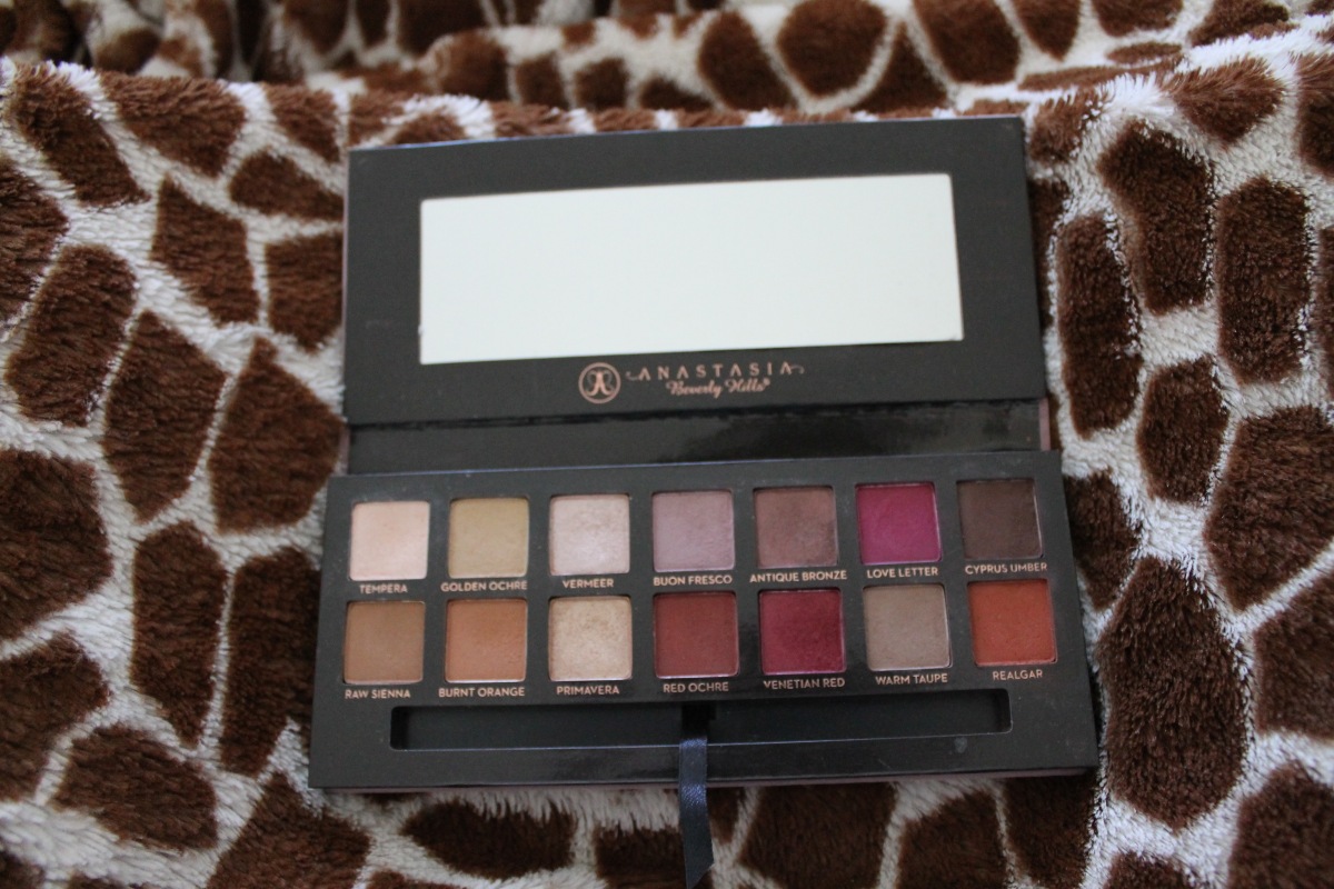
To start with, I’m overall super in love with this palette. Almost every shade feels soft and buttery to the touch, and they all blend like a dream. Before I bought this palette I didn’t understand how an eye shadow could be buttery, or why people spent tons of money on expensive eye shadows when cheaper ones do the same thing. I get it now. I really do. If you’re looking to purchase your first higher end eye shadow palette, I’d say this one is a great place to start. It also comes with a brush, which I know some people haven’t liked, but I absolutely love it. The denser portion is great for inner corner highlighting and bottom lid shadow application. The fluffier side is great for blending and building product up in your crease. I use it every time I use this palette.
I have two cons to this palette, neither of which I think are a big deal. My first complaint is that the shadows are all powdery. Some kick up more shadow than others, but they all have quite a bit of fall out. As long as you tap your brush off before applying to the lid, I don’t think the powderiness detracts from the experience at all. My other complaint is the packaging. One, it’s made of cardboard, which I don’t love; if I’m paying $42 for something, I’d prefer it be in sturdier packaging. Two, the outside is covered in a light pinky-purple velvet-like material, which gets super dirty if you even look at it wrong. As someone whose hands are always covered in makeup products, this is a huge problem. My palette is so dirty all over which bugs me, but it’s so hard to clean that I can’t do anything about it. But I guess since the inside is so beautiful I can deal with less than ideal packaging.
Here are some swatches of all the shadows! These are all done on top of Wet n Wild Fergie Take On the Day Primer. There are two swatches for each shade; the one on the left is a finger swatch and the one on the right is with a brush. The same brush was used for each swatch, but cleaned between colors. The colors are listed and reviewed from left to right.
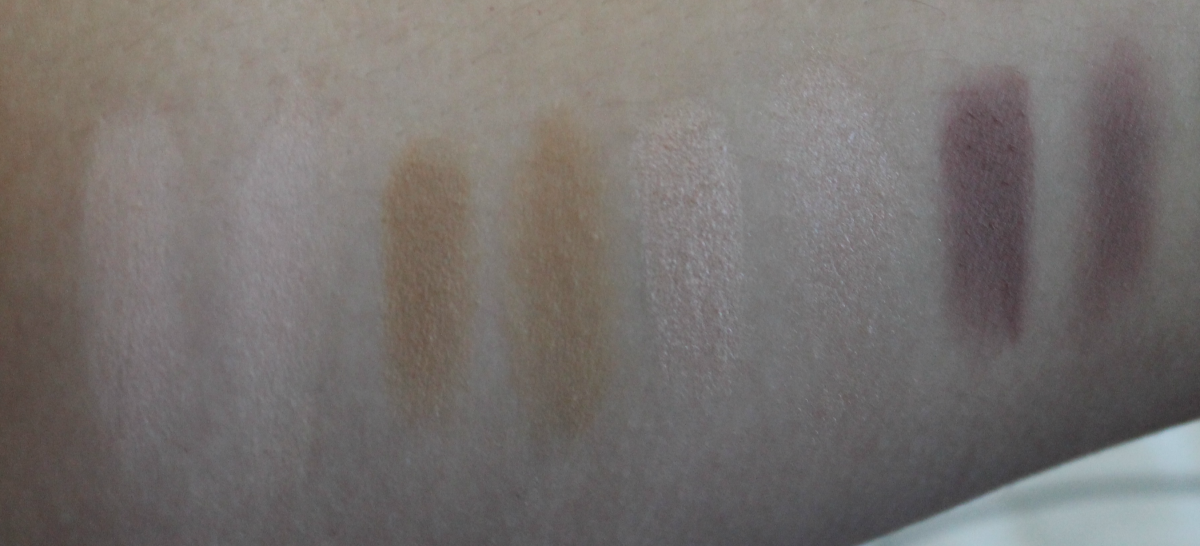
Tempera: This is a matte pinky-cream color that I like to use all over my lid before I apply other colors. Very easy to work with, and unlike some light shadows it doesn’t emphasize fine lines.
Golden Ochre: This is a matte mustardy-yellow type of color. At first glance I didn’t think I’d use it at all, but I actually love it. I like to use it similar to Tempera and put it all over my lid for warm, orangey looks.
Vermeer: This is a shimmery silvery-pink color. I’ll put this all over my lid on days where I want a little bit of sparkle. I’ll also sometimes use this as a highlight on my inner corner and on my brow bone.
Buon Fresco: This is a matte grey-lilac color. I find this can pull a little too grey sometimes, so if you’re looking for a true purple then this color may not be up your alley. But I like it for blending into the crease for a softer look.
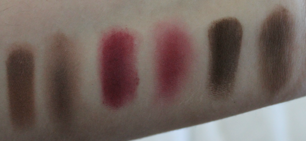
Antique Bronze: This is a stain brown color that almost looks like it has a tiiiiny bit of purple mixed into it. This is a darker color and also has more powder kickup than the other colors. This is great for darkening up the inner corner.
Lover Letter: This is a matte fuschia-berry color. I actually love to do looks with this blended into the crease and on the outer-V of the eye. This is a fun, buildable color and it blends super well. This shadow feels drier than the others, but it works well so it’s not a big deal.
Cyprus Umber: This is a matte dark brown that I use to deepen the outer corner of the eye. Like Antique Bronze, it kicks up a lot of powder. You really need to tap your brush off or else you’ll add waaaay more than you want.
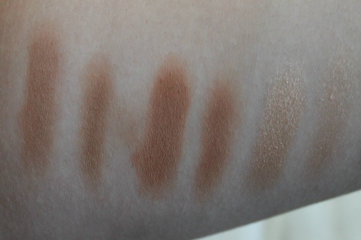
Raw Sienna: This is a matte medium brown that I use in my crease pretty much every day. It also looks nice all over the lid if you’re going for a more neutral, conservative look.
Burnt Orange: This is a matte warm light brown-orange. I use this much the same way as Raw Sienna; either in my crease or all over the lid, depending on the look I’m going for.
Primavera: This is a shimmery gold champagne color. I like to use this all over the lid. I personally don’t like to use such warm golds for my inner corner or brow bone highlight, but if you do this would work super well. I pretty much only wear this all over my lid, but it looks beautiful so I’m not complaining.
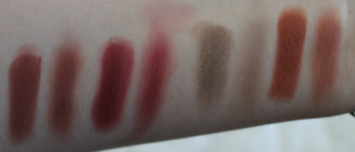
Red Ochre: This is a matte deep red-brown color. I use this mostly on my lower lash line and in my outer corner. Sometimes I’ll go into the crease a little bit if it’s a really intense look. This is another shadow that feels just a little bit drier than the others, but it still blends beautifully so it don’t mind too much.
Venetian Red: This is a medium-dark matte red. It’s buildable and blendable and I like using it in the outer corner and the crease and sometimes on the lower lash line. I think this is my favorite red shadow I’ve ever used.
Warm Taupe: This is the quintessential crease color that everyone knows and loves: a warm, matte, taupe color. I use this in my crease almost every day. No matter what colors you use, this color blends in and deepens the crease just enough to add dimension to the look.
Realgar: This is my absolute favorite color. It’s a matte burnt orange color. Maybe it’s because fall is approaching, but I have been loving burnt orange lately. This looks great blended in and above the crease or all over the lid. It’s a little dry, but again, it performs so well that I don’t mind one bit.
Here are some looks I’ve created with this palette in the last couple of weeks. For each look I used only shadows from this palette. I also tried to make these looks super wearable for every day. I used every shadow at least once in the process of making these looks and I’ll list them below each picture. Enjoy!
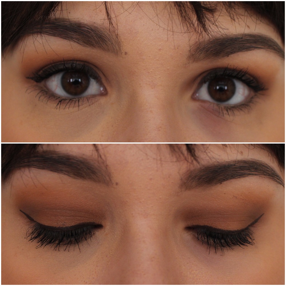
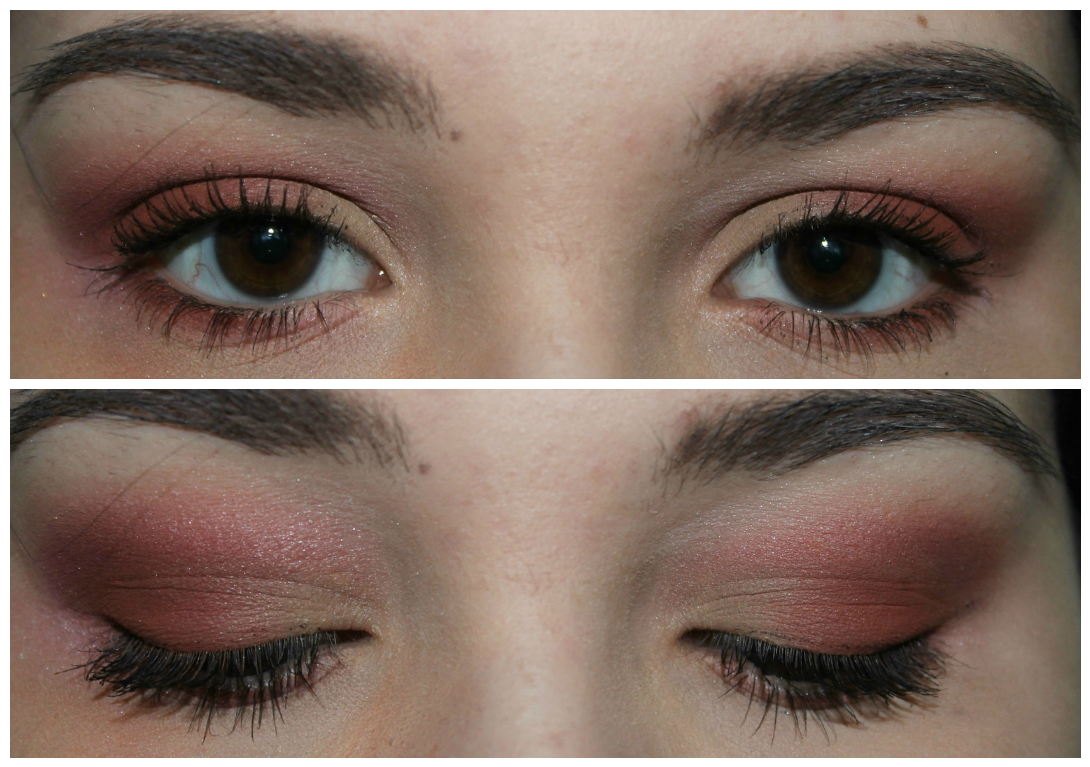
This is one of my favorite every day looks. I started by putting Tempera all over. I put Raw Sienna all over the lid, blended Burnt Orange above the crease, blended Warm Taupe into the crease and outer corner and on the lower lid.
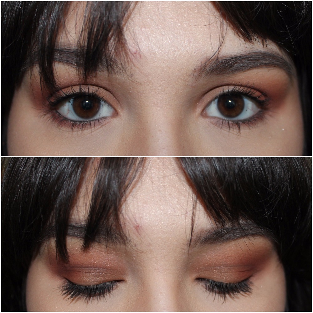
This is similar to the last look, but with more orange. I used Tempera all over, Raw Sienna on the lid, Warm Taupe in the crease, Burnt Orange above the crease, Realgar blended in the outer corner and in the outer half of the crease, and Cyprus Umber in the outer corner and lower lid.
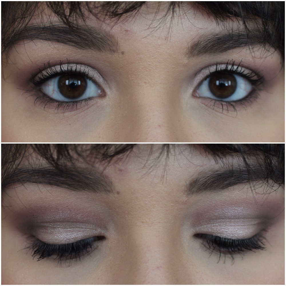
For this look I put Tempera all over, Vermeer on the lid, Warm Taupe in the crease, Buon Fresco above the crease, and I mixed Warm Taupe and Buon Fresco on the lower lid. I also added a little bit of Antique Bronze to the outer corner.
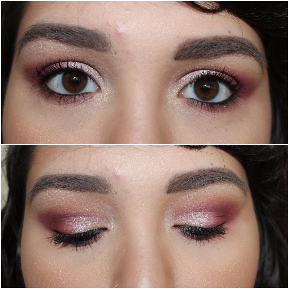
This is one of my favorite special even looks! I wore this to a friend’s wedding and got nothing but compliments. I used Primavera on the lid, Warm Taupe in the crease, Love Letter above the crease and blended on the outer half of the lid, and a little bit of Raw Sienna to blend out the edges. I put some Love Letter and Warm Taupe along the bottom lid.
This look is one I specifically did to usher in Fall! I think this palette is perfect for all Fall looks, this is just an example. I put Tempera all over, Golden Ochre on the inner half of the lid, Realgar on the outer half of the lid, Warm Taupe in the Crease, Venetian Red on the upper crease and outer corner, and Red Ochre in the outer corner and on the lower lid.
What product do you want to see reviewed next? Let me know in the comments section below!
Don’t forget to follow me here or like my page on Facebook for the latest posts!

Lovely review x
LikeLiked by 1 person